Today I had the opportunity to take a letterpress workshop for fun (not cheap), and let me tell you – it’s hard work, but it produces the best works. I’ve taken a few photos of the workshop and what we made today while learning the process of using a letterpress.
Here are the Typecases laid out in a common configuration called the California Layout. It was really neat to learn about why each letter was placed where it is in the layout. For instance the lower case letters, spaces of varying sizes, and punctuations are configured by frequency of usage, however, all the capital letters are in alphabetical order because they aren’t used as much.
This is the actual letterpress! It was made in the 1920’s, and is one fascinating piece of machinery. These guys acquired it a few years ago and decided to rent a facility to allow the community to come learn and eventually play with it on their own. Grand idea!
 Here is one of the images I made. I didn’t create the design; it was something the designer came up with to teach us. The actual design he created was printed and cut out into what is called a photopolymer plate, which is why we were able to get such a unique design instead of just letters. (Can’t wait to go back and play with all the letters and fonts!)
 The design is an iPhone with the word “Holla!” inside it. The designer said he thought it was an interesting idea to juxtaopse the modern phone design with the 1922 letterpress.
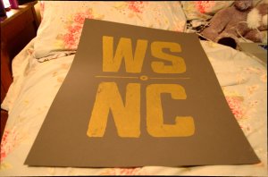
 And at the end of the day, the boys surprised me with one of their prints I had been drooling over all morning! I. LOVE. IT.

